React native comes with a Picker element out of the box. However, if you try to include this picker element immediately, it may not work really well with your iOS app. Right out of the box, Picker element for iOS will render a full height scroller. Here’s how the picker element look like on its own:
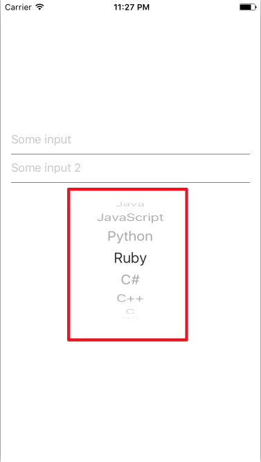
From the looks of it, we would need to somehow wrap this scroller selection in a modal dialog of its own!
Let’s create FormSelect component that can work with both Android and iOS from the get go.
First brush with Picker element
I wanted to ask the user of my app what programming language that they prefer to be writing with. The selections are limited to 7 languages:
- Java
- Javascript
- C#
- Python
- Ruby
- Go
- C++
A light bulb went on in my head and thought “What better element can represent selection with 1 valid value other than Picker!”
So there I went, thinking that Picker element would work equally well in both Android and iOS, so I included a Picker right after a TextInput in one of the form I was creating.
| import React, { Component } from "react"; | |
| import { | |
| AppRegistry, | |
| Picker, | |
| Platform, | |
| StyleSheet, | |
| TextInput, | |
| View | |
| } from "react-native"; | |
| const programmingLanguages = [ | |
| { | |
| label: 'Java', | |
| value: 'java', | |
| }, | |
| { | |
| label: 'JavaScript', | |
| value: 'js', | |
| }, | |
| { | |
| label: 'Python', | |
| value: 'python', | |
| }, | |
| { | |
| label: 'Ruby', | |
| value: 'ruby', | |
| }, | |
| { | |
| label: 'C#', | |
| value: 'csharp', | |
| }, | |
| { | |
| label: 'C++', | |
| value: 'cpp', | |
| }, | |
| { | |
| label: 'C', | |
| value: 'c', | |
| }, | |
| { | |
| label: 'Go', | |
| value: 'go', | |
| } | |
| ]; | |
| class App extends Component { | |
| constructor(props) { | |
| super(props); | |
| this.state = { | |
| text1: '', | |
| text2: '', | |
| language: '', | |
| }; | |
| } | |
| render() { | |
| return ( | |
| <View style={styles.container}> | |
| <View style={styles.content}> | |
| <View style={styles.inputContainer}> | |
| <TextInput | |
| placeholder={'Some input'} | |
| style={styles.input} | |
| onChangeText={text1 => this.setState({ text1 })} | |
| value={this.state.text1} | |
| /> | |
| </View> | |
| <View style={styles.inputContainer}> | |
| <TextInput | |
| placeholder={'Some input 2'} | |
| style={styles.input} | |
| onChangeText={text2 => this.setState({ text2 })} | |
| value={this.state.text2} | |
| /> | |
| </View> | |
| <Picker | |
| selectedValue={this.state.language} | |
| onValueChange={itemValue => this.setState({ language: itemValue })}> | |
| {programmingLanguages.map((i, index) => ( | |
| <Picker.Item key={index} label={i.label} value={i.value} /> | |
| ))} | |
| </Picker> | |
| </View> | |
| </View> | |
| ); | |
| } | |
| } | |
| const styles = StyleSheet.create({ | |
| container: { | |
| flex: 1, | |
| justifyContent: 'center', | |
| alignItems: 'center', | |
| }, | |
| content: { | |
| marginLeft: 15, | |
| marginRight: 15, | |
| marginBottom: 5, | |
| alignSelf: 'stretch', | |
| justifyContent: 'center', | |
| }, | |
| inputContainer: { | |
| ...Platform.select({ | |
| ios: { | |
| borderBottomColor: 'gray', | |
| borderBottomWidth: 1, | |
| }, | |
| }), | |
| }, | |
| input: { | |
| height: 40 | |
| } | |
| }); | |
| AppRegistry.registerComponent('FormPicker', () => App); |
When testing out the application in both Android and iOS, I realised how wrong I was.
In Android, it was quite smooth, a select box was rendered along with dropdown button on the right side of the box. Clicking on it will trigger a pop up where I can pick the value that I need.
In iOS though, all of a sudden there’s a huge tumbler smacked right after the TextInput. It is fully functional, but definitely not a good experience. So I decided to wrap the Picker component in iOS in a Modal window to ensure that the tumbler does not look as if it is out of its element.
Including picker in Android
Picker element in android works almost out of the box, it will render an inline element with pop up window to select one of the item.
To enable picker in Android, let’s create a simple FormPicker class that returns a picker element;
| import React, { Component } from "react"; | |
| import { Picker } from "react-native"; | |
| class FormPicker extends React.Component { | |
| constructor(props) { | |
| super(props); | |
| this.state = { | |
| modalVisible: false | |
| } | |
| } | |
| render() { | |
| return ( | |
| <Picker | |
| selectedValue={this.props.value} | |
| onValueChange={this.props.onValueChange} | |
| > | |
| {this.props.items.map((i, index) => ( | |
| <Picker.Item key={index} label={i.label} value={i.value} /> | |
| ))} | |
| </Picker> | |
| ); | |
| } | |
| } |
Including picker in iOS
In iOS, Picker can be trickier; especially when it comes to an inline element. We would want to render the picker in a separate modal dialog and read the updated value back to the inline element (in this case an InputText).
In order to do this, we need to create a new class that would keep the state of the modal (opened or closed) that contains the Picker and push back the value selected in the modal dialog to the parent component.
After a little bit of trial and error, the following FormPicker class would render a proper modal dialog in iOS for the select component.
| import React, { Component } from "react"; | |
| import { | |
| Picker, | |
| Modal, | |
| TouchableWithoutFeedback, | |
| Text, | |
| View, | |
| View, | |
| Picker, | |
| TextInput, | |
| Dimensions, | |
| TouchableOpacity | |
| } from "react-native"; | |
| class FormPicker extends React.Component { | |
| constructor(props) { | |
| super(props); | |
| this.state = { | |
| modalVisible: false | |
| } | |
| } | |
| render() { | |
| return ( | |
| <View style={styles.inputContainer}> | |
| <TouchableOpacity | |
| onPress={() => this.setState({ modalVisible: true })} | |
| > | |
| <TextInput | |
| style={styles.input} | |
| editable={false} | |
| placeholder="Select language" | |
| onChangeText={searchString => { | |
| this.setState({ searchString }); | |
| }} | |
| value={this.props.value} | |
| /> | |
| </TouchableOpacity> | |
| <Modal | |
| animationType="slide" | |
| transparent={true} | |
| visible={this.state.modalVisible} | |
| > | |
| <TouchableWithoutFeedback | |
| onPress={() => this.setState({ modalVisible: false })} | |
| > | |
| <View style={styles.modalContainer}> | |
| <View style={styles.buttonContainer}> | |
| <Text | |
| style={{ color: "blue" }} | |
| onPress={() => this.setState({ modalVisible: false })} | |
| > | |
| Done | |
| </Text> | |
| </View> | |
| <View> | |
| <Picker | |
| selectedValue={this.props.value} | |
| onValueChange={this.props.onValueChange} | |
| > | |
| {this.props.items.map((i, index) => ( | |
| <Picker.Item | |
| key={index} | |
| label={i.label} | |
| value={i.value} | |
| /> | |
| ))} | |
| </Picker> | |
| </View> | |
| </View> | |
| </TouchableWithoutFeedback> | |
| </Modal> | |
| </View> | |
| ); | |
| } | |
| }; | |
| const styles = StyleSheet.create({ | |
| inputContainer: { | |
| ...Platform.select({ | |
| ios: { | |
| borderBottomColor: "gray", | |
| borderBottomWidth: 1 | |
| } | |
| }) | |
| }, | |
| input: { | |
| height: 40 | |
| }, | |
| modalContainer: { | |
| flex: 1, | |
| justifyContent: "flex-end" | |
| }, | |
| buttonContainer: { | |
| justifyContent: "flex-end", | |
| flexDirection: "row", | |
| padding: 4, | |
| backgroundColor: "#ececec" | |
| } | |
| }); |
Getting one entry point
In order to ease the usage of the Picker element, we can wrap both Android and iOS pickers in one class. In order to do that, we can repurpose the FormPicker classes we created earlier to cater for both systems.
The FormPicker class would then need to be injected with:
- The available values for the picker
- Currently selected value of the picker
- Function to invoke when an element in the picker is selected to update the parent’s form value
- Placeholder text when no value is selected yet
With this needs in mind, we can then write the FormPicker element like so:
| import React, { Component } from "react"; | |
| import { | |
| Modal, | |
| TouchableWithoutFeedback, | |
| Text, | |
| StyleSheet, | |
| Platform, | |
| View, | |
| Picker, | |
| TextInput, | |
| TouchableOpacity, | |
| AppRegistry | |
| } from "react-native"; | |
| const programmingLanguages = [ | |
| { | |
| label: "Java", | |
| value: "java" | |
| }, | |
| { | |
| label: "JavaScript", | |
| value: "js" | |
| }, | |
| { | |
| label: "Python", | |
| value: "python" | |
| }, | |
| { | |
| label: "Ruby", | |
| value: "ruby" | |
| }, | |
| { | |
| label: "C#", | |
| value: "csharp" | |
| }, | |
| { | |
| label: "C++", | |
| value: "cpp" | |
| }, | |
| { | |
| label: "C", | |
| value: "c" | |
| }, | |
| { | |
| label: "Go", | |
| value: "go" | |
| } | |
| ]; | |
| class FormPicker extends Component { | |
| constructor(props) { | |
| super(props); | |
| this.state = { | |
| modalVisible: false | |
| }; | |
| } | |
| render() { | |
| if (Platform.OS === "android") { | |
| return ( | |
| <Picker | |
| selectedValue={this.props.value} | |
| onValueChange={this.props.onValueChange} | |
| > | |
| {this.props.items.map((i, index) => ( | |
| <Picker.Item key={index} label={i.label} value={i.value} /> | |
| ))} | |
| </Picker> | |
| ); | |
| } else { | |
| const selectedItem = this.props.items.find( | |
| i => i.value === this.props.value | |
| ); | |
| const selectedLabel = selectedItem ? selectedItem.label : ""; | |
| return ( | |
| <View style={styles.inputContainer}> | |
| <TouchableOpacity | |
| onPress={() => this.setState({ modalVisible: true })} | |
| > | |
| <TextInput | |
| style={styles.input} | |
| editable={false} | |
| placeholder="Select language" | |
| onChangeText={searchString => { | |
| this.setState({ searchString }); | |
| }} | |
| value={selectedLabel} | |
| /> | |
| </TouchableOpacity> | |
| <Modal | |
| animationType="slide" | |
| transparent={true} | |
| visible={this.state.modalVisible} | |
| > | |
| <TouchableWithoutFeedback | |
| onPress={() => this.setState({ modalVisible: false })} | |
| > | |
| <View style={styles.modalContainer}> | |
| <View style={styles.modalContent}> | |
| <Text | |
| style={{ color: "blue" }} | |
| onPress={() => this.setState({ modalVisible: false })} | |
| > | |
| Done | |
| </Text> | |
| </View> | |
| <View | |
| onStartShouldSetResponder={evt => true} | |
| onResponderReject={evt => {}} | |
| > | |
| <Picker | |
| selectedValue={this.props.value} | |
| onValueChange={this.props.onValueChange} | |
| > | |
| {this.props.items.map((i, index) => ( | |
| <Picker.Item | |
| key={index} | |
| label={i.label} | |
| value={i.value} | |
| /> | |
| ))} | |
| </Picker> | |
| </View> | |
| </View> | |
| </TouchableWithoutFeedback> | |
| </Modal> | |
| </View> | |
| ); | |
| } | |
| } | |
| } | |
| class App extends Component { | |
| constructor(props) { | |
| super(props); | |
| this.state = { | |
| text1: "", | |
| text2: "", | |
| language: "" | |
| }; | |
| } | |
| render() { | |
| return ( | |
| <View style={styles.container}> | |
| <View style={styles.content}> | |
| <View style={styles.inputContainer}> | |
| <TextInput | |
| placeholder={"Some input"} | |
| style={styles.input} | |
| onChangeText={text1 => this.setState({ text1 })} | |
| value={this.state.text1} | |
| /> | |
| </View> | |
| <View style={styles.inputContainer}> | |
| <TextInput | |
| placeholder={"Some input 2"} | |
| style={styles.input} | |
| onChangeText={text2 => this.setState({ text2 })} | |
| value={this.state.text2} | |
| /> | |
| </View> | |
| <FormPicker | |
| items={programmingLanguages} | |
| value={this.state.language} | |
| onValueChange={(itemValue, itemIndex) => | |
| this.setState({ language: itemValue })} | |
| /> | |
| </View> | |
| </View> | |
| ); | |
| } | |
| } | |
| const styles = StyleSheet.create({ | |
| container: { | |
| flex: 1, | |
| justifyContent: "center", | |
| alignItems: "center" | |
| }, | |
| content: { | |
| marginLeft: 15, | |
| marginRight: 15, | |
| marginBottom: 5, | |
| alignSelf: "stretch", | |
| justifyContent: "center" | |
| }, | |
| inputContainer: { | |
| ...Platform.select({ | |
| ios: { | |
| borderBottomColor: "gray", | |
| borderBottomWidth: 1 | |
| } | |
| }) | |
| }, | |
| input: { | |
| height: 40 | |
| }, | |
| modalContainer: { | |
| flex: 1, | |
| justifyContent: "flex-end" | |
| }, | |
| modalContent: { | |
| justifyContent: "flex-end", | |
| flexDirection: "row", | |
| padding: 4, | |
| backgroundColor: "#ececec" | |
| } | |
| }); | |
| AppRegistry.registerComponent('FormPicker', () => App); |
Here’s the complete app in action through application hosted in exponent.
What do you guys think? Any better way to deal with Picker element in both iOS and Android ( aside from libraries 😉 )? Let me know in the comment!